Rebranding an
Advertising Icon
My Roles —
Research
Visual Identity
User Experience
Interface Design
Furniture Design
Custom Typography
Furniture Build
Description:
Wongdoody is a national advertising agency that is globally recognized for its work. The agency was founded in 1993 by Tracy Wong and Pat Doody and has grown into an advertising icon.
Challenge:
The old branding didn’t accurately represent who Wongdoody had become. With a unique name like Wongdoody and the equally unique personality of Tracy Wong at the helm, the agency wanted the brand to convey the energy and excitement they bring to client work.
Journey:
We had the privilege of working at Wongdoody, so we experienced first hand who Wongdoody was, but we needed to step back and challenge each of our perceptions to make sure we got to the core “Why” of Wongdoody. From the discovery process, we learned that Wongdoody is about bringing excitement and enthusiasm to every client meeting, every script reading, and any project that is undertaken. These understandings formed the idea and identity around the trademark of enthusiasm.
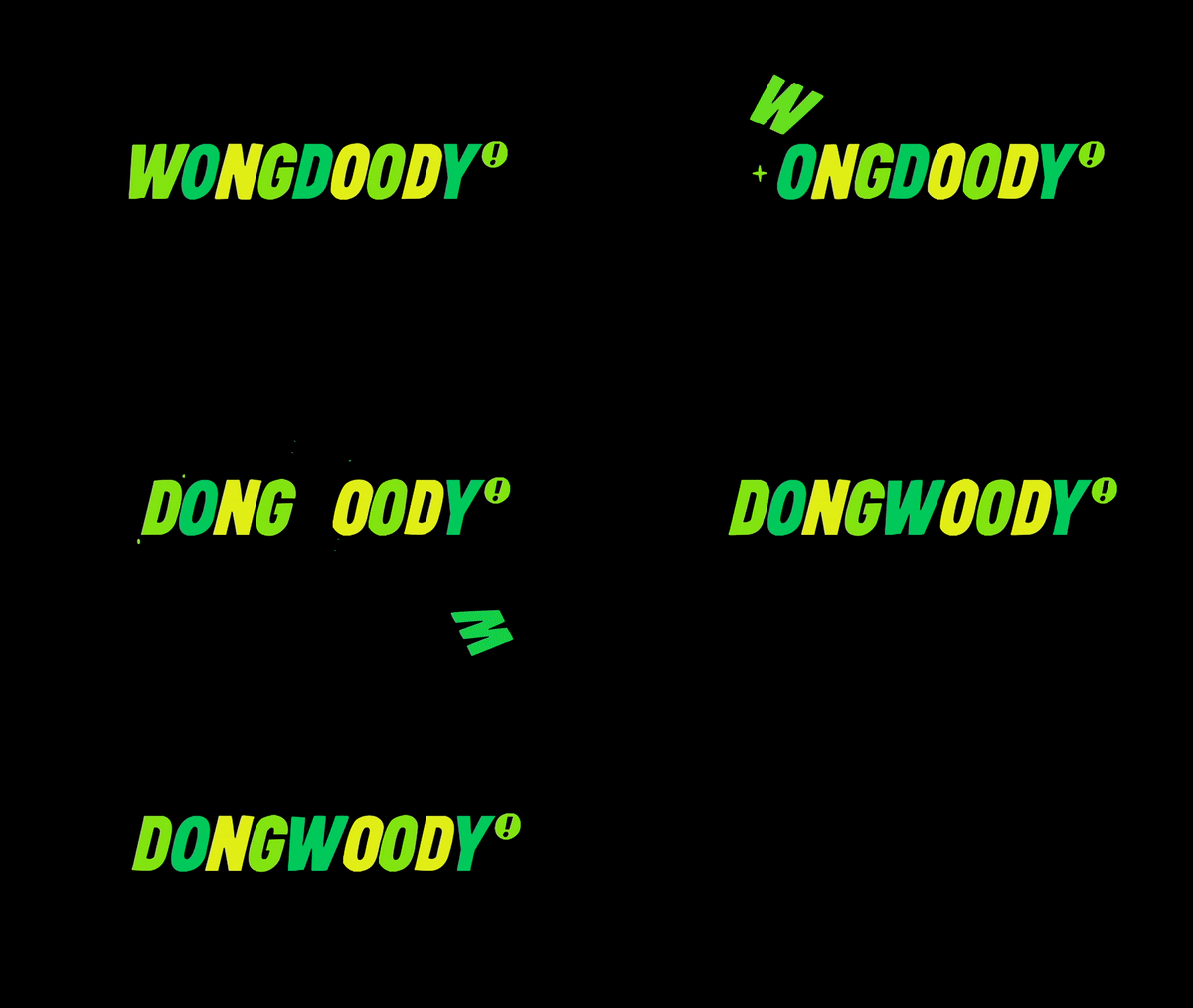
The trademark of enthusiasm is the combination of positive energy and crazy work ethic that go into everything Wongdoody. The mark is also the stamp of approval everything must receive before it goes out the door. We started by creating a new bold typeface that’s punctuated with the trademark of enthusiasm. The green and black color palette has always been a part of the Wongdoody brand and is a nod to the founding partners’ cultural heritage. We wanted not only to keep it but play it up by intensifying it to a more energetic neon color range. Also included throughout the branding is what we called the ‘mangles.’ These are all the misspellings addressed on envelopes and mispronunciations we heard in meetings over the years. We then took the foundational visual language and let it spread onto anything that felt ‘Fuck Yeah!’ as Tracy Wong would say. The expressions included a new website, a new hire kit that comes in a fanny pack, neon signage, and custom furniture with powder coated neon green accents.
Outcome:
The branding was praised and won a bunch of awards. But the best part is that it has captured the excitement of Wongdoody. Years later and the branding still feels authentic to the agency and is flexible enough that it continues to evolve into new expressions.
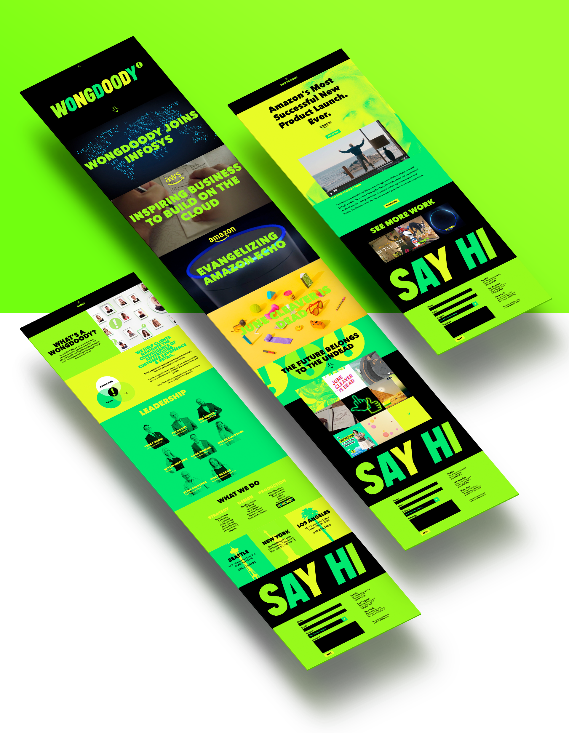
Website
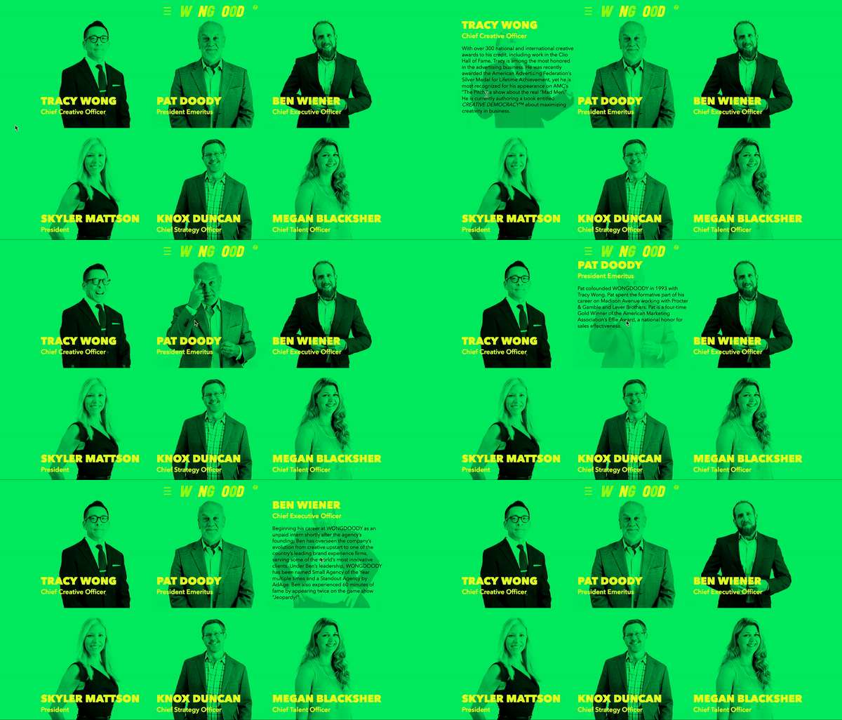
One of the first expressions we explored was the website. We wanted the site to be responsive, and we also wanted every section on the site simplified and distilled to its core idea. We believe that the work speaks for itself, so the site should live as an expression of the team behind the work.
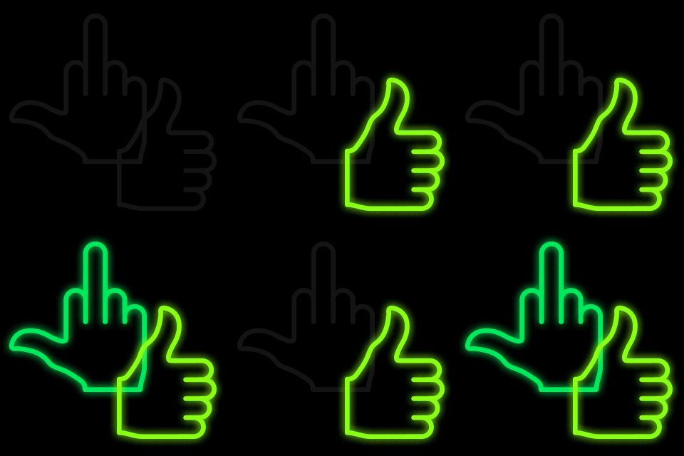
The site also has a very Wongdoody easter egg of of mangle videos. Visit the homepage and click on the exclamation point on the logo – Wongdoody.com
New Hire Kit
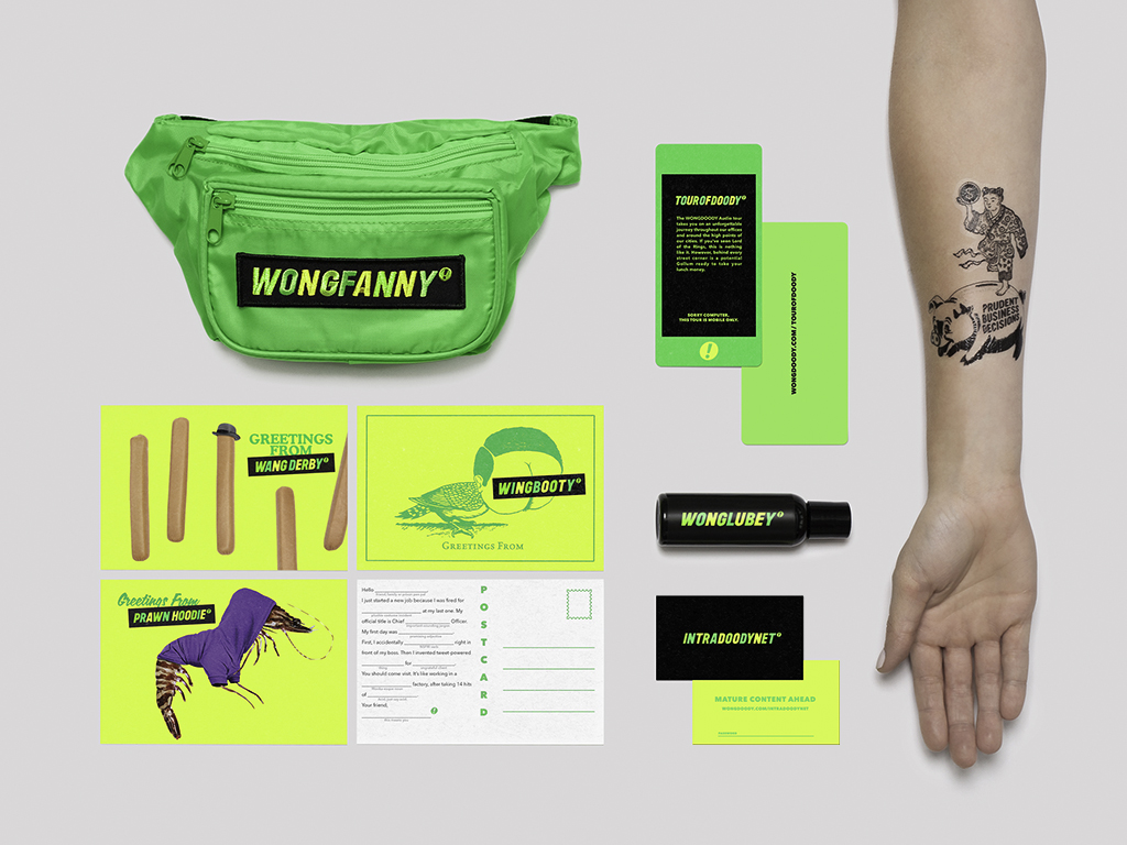
The new hire kit contains everything a person would need on their first day at a company named Wongdoody. Contents include a bottle of Wonglubey, Madlib style postcards to tell your loved ones about your new adventure, the Intradoodynet access card, company values temporary tattoos, and an invitation to take the Tour of Doody. Everything comes packaged in a hot neon green fanny pack.

Tour of Doody
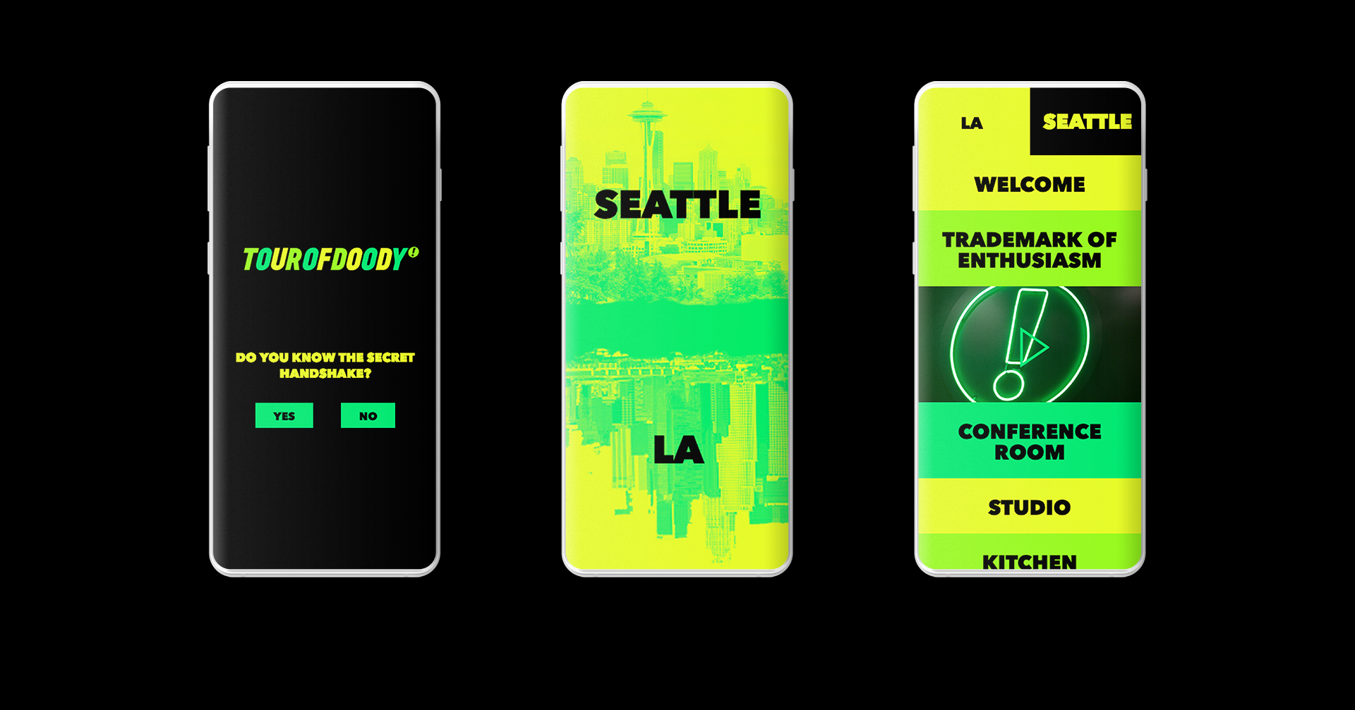
The Tour of Doody is a mobile web app that gives users a self-guided audio tour of the offices and their surrounding communities. Even if you’re not a new hire, I recommend taking the tour. But please be warned, it’s NSFW, and nothing can be unheard.
Tour of Doody – Only works on mobile screen sizes.
Stationary
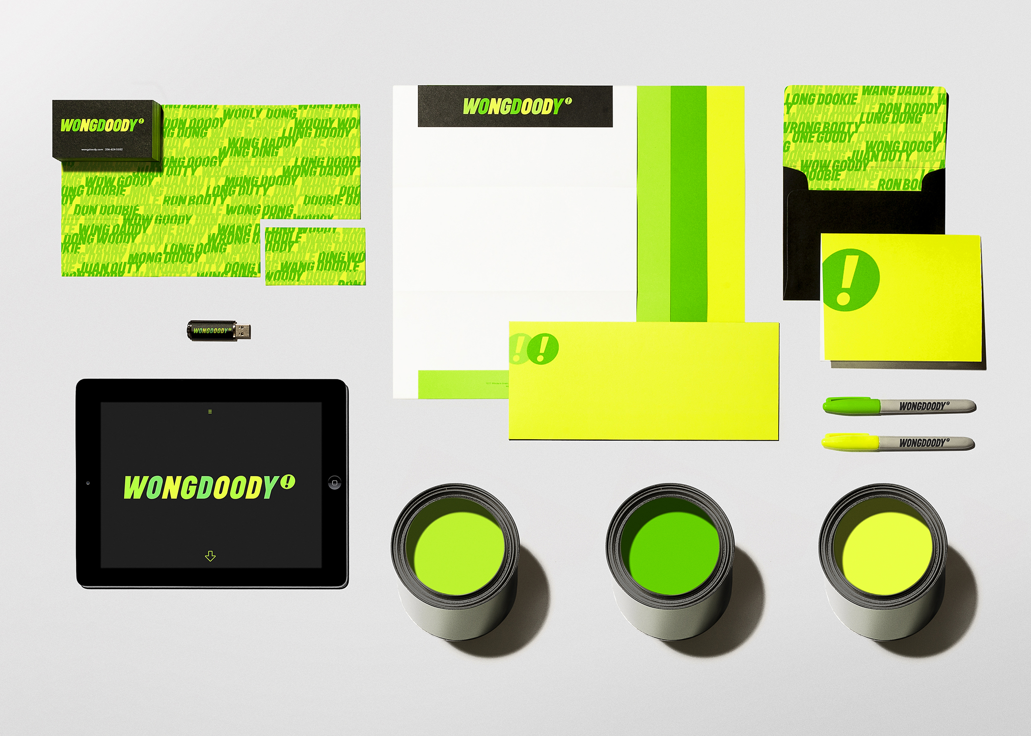
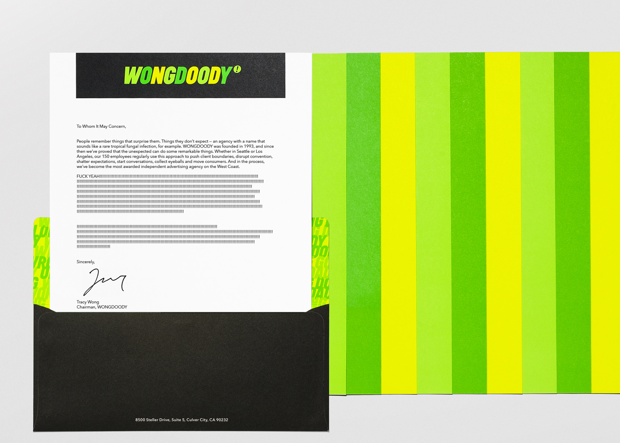
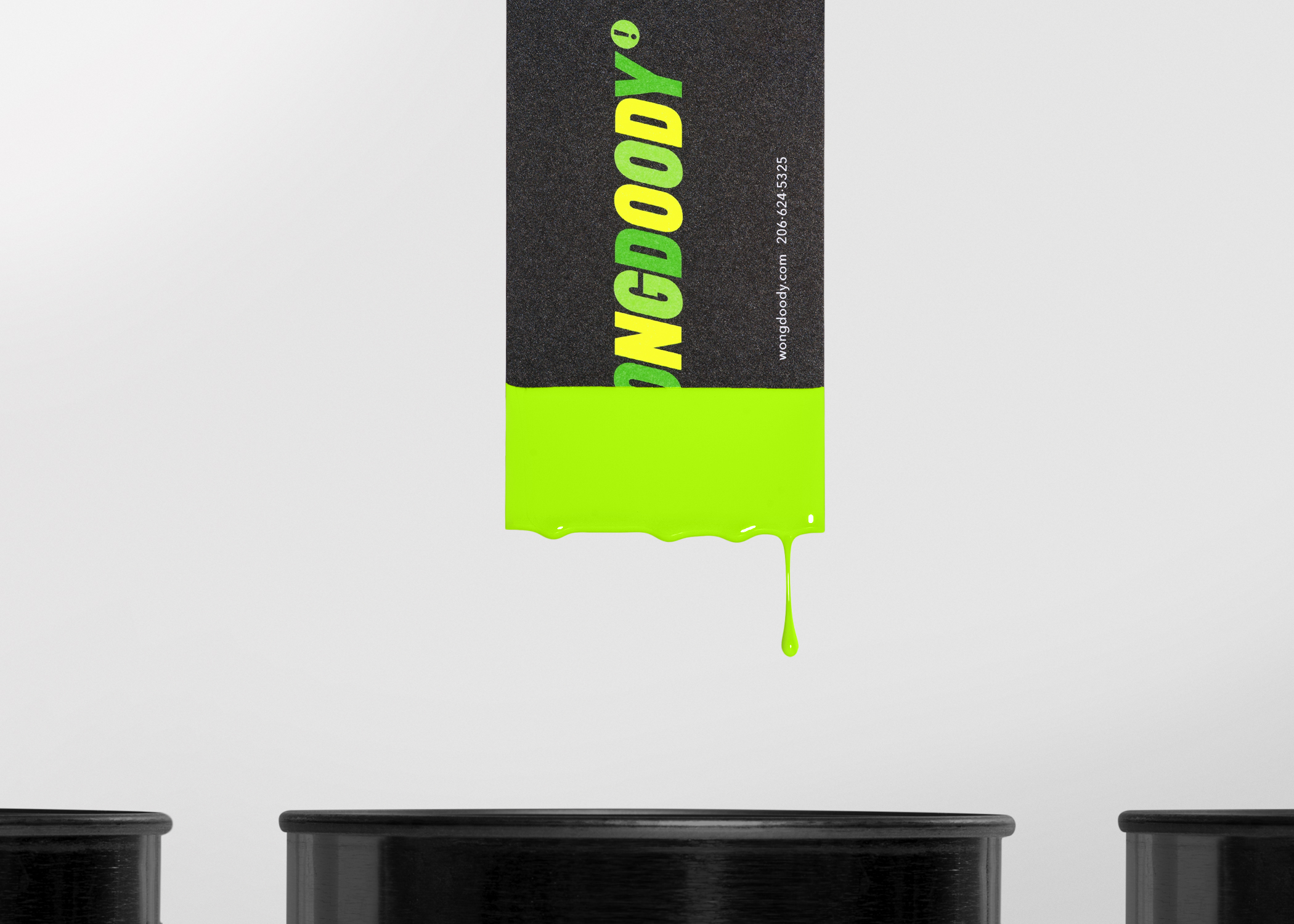
We knew that the colors we chose to represent the brand are high energy and printing in four color process wasn’t going to do them justice. We worked with the printer to create custom colors for all the print materials.

Furniture
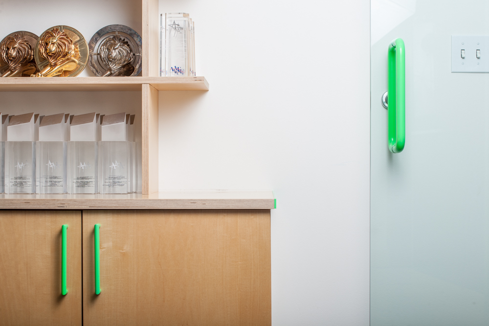
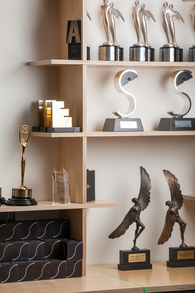
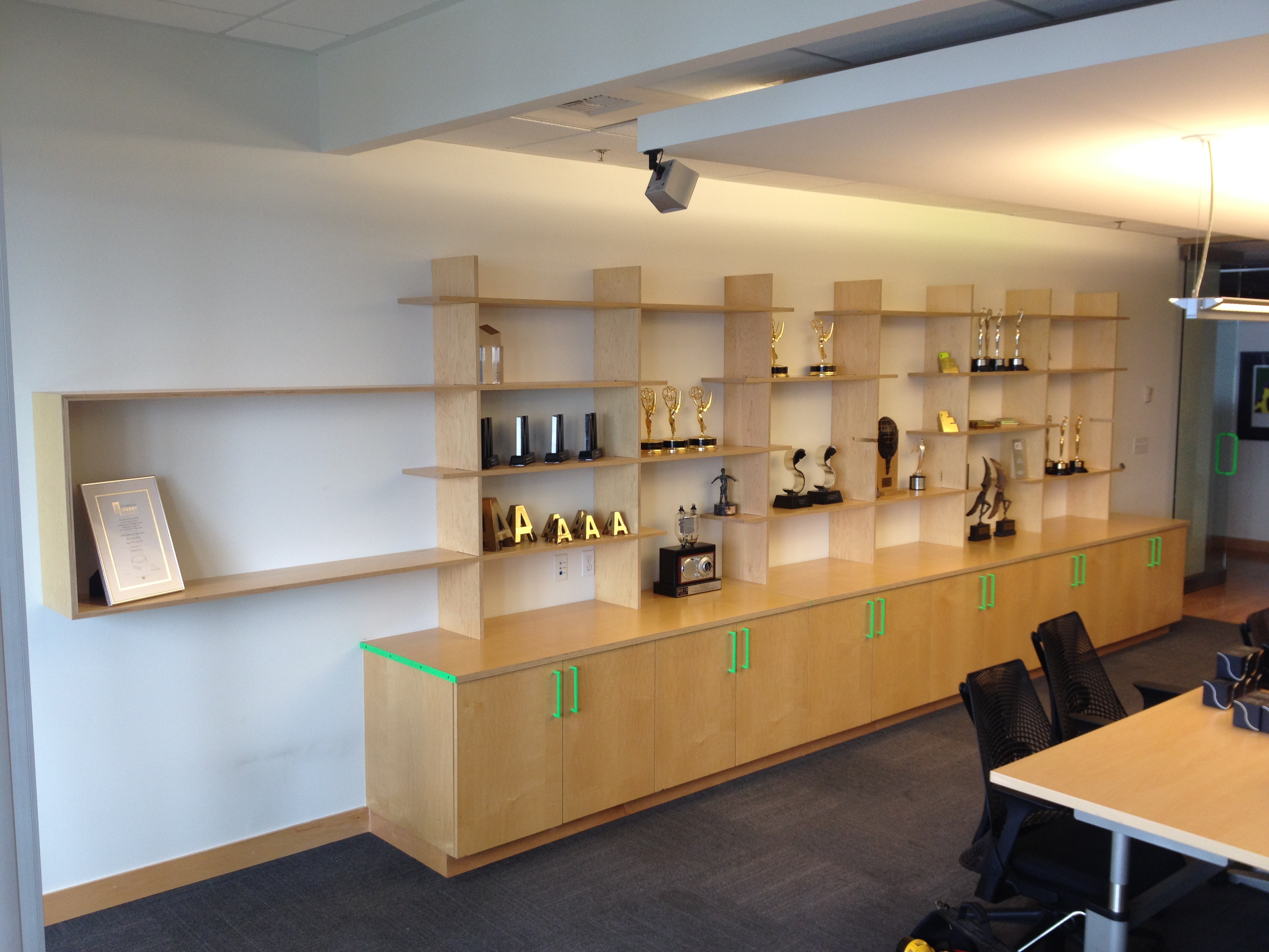
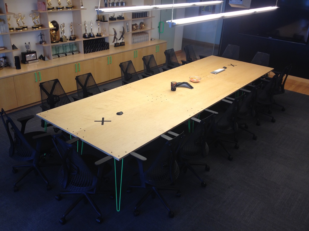
I recruited my brothers, who are both carpenters, to help me design and build new furniture for the Seattle office. We designed and built a modular shelving unit to display awards in the main conference room, a modular conference table that breaks apart to create smaller tables, and a bench that is inlaid with a metal neon green divider for the lobby.
