Transforming two separate apps into one motivating experience
My Roles —
Research
User Experience
Interface Design
Description:
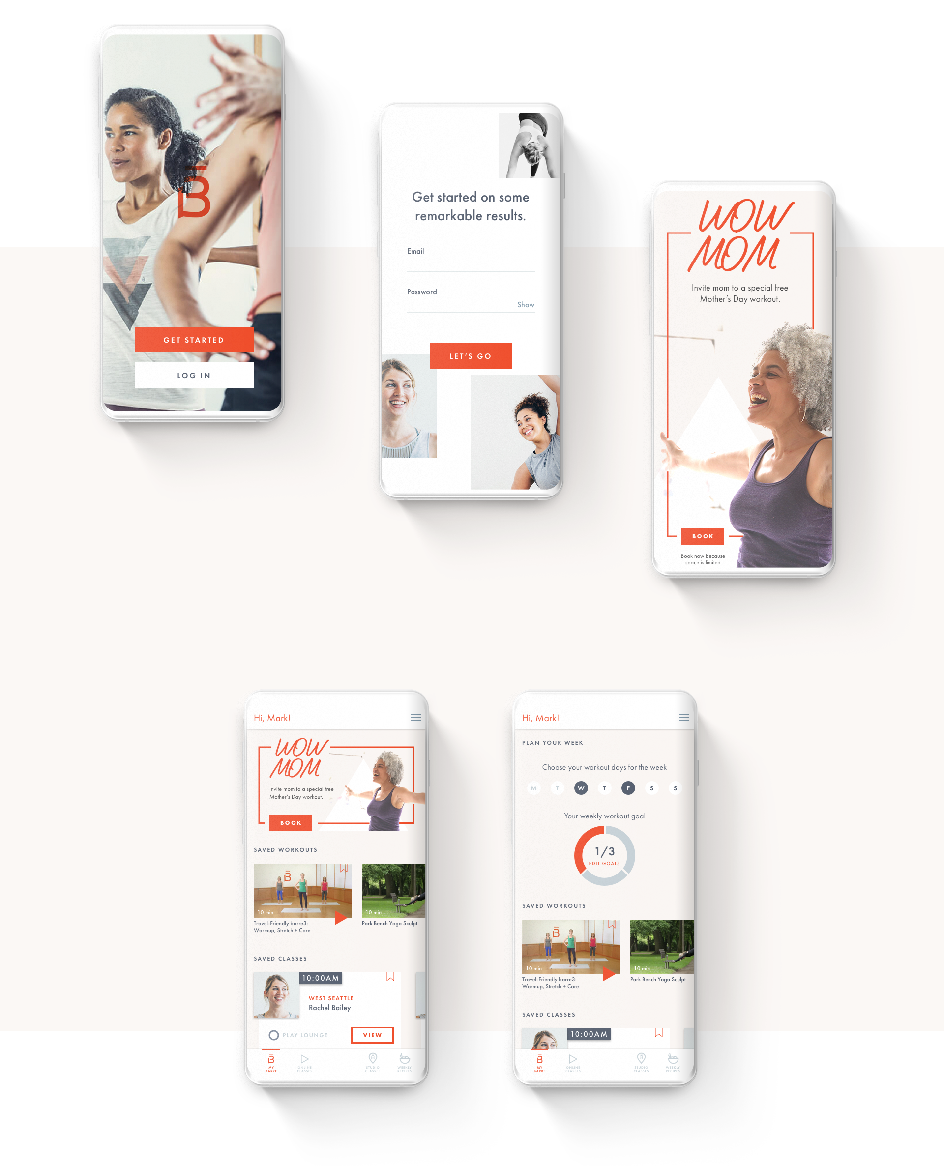
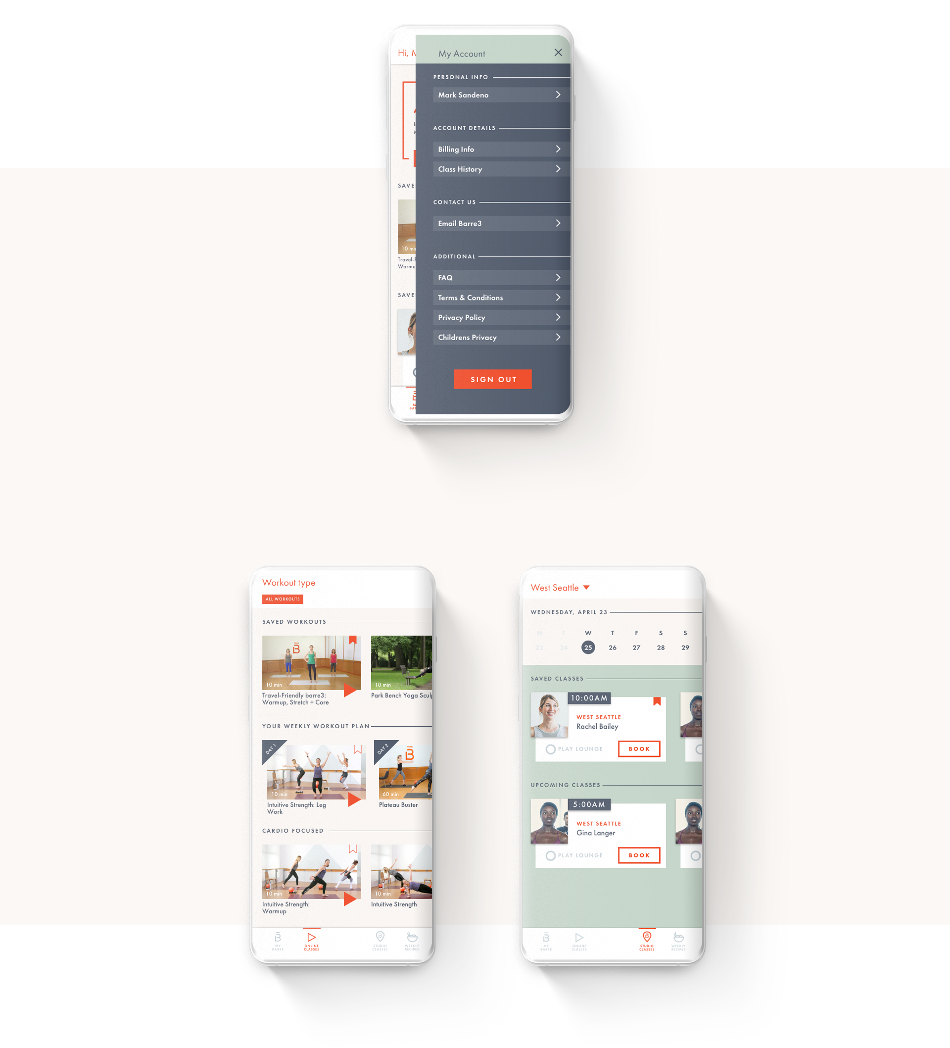
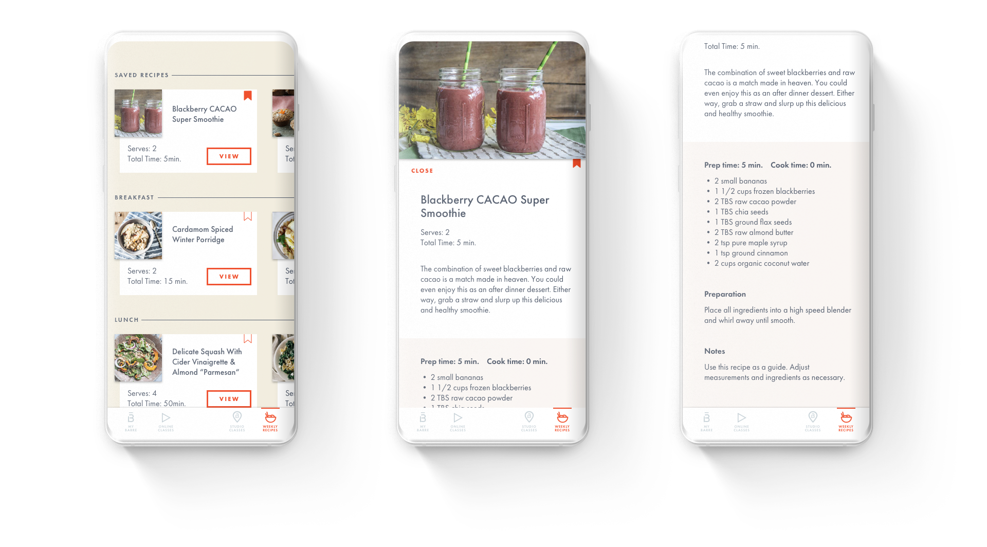
Barre3 was using two different apps, and neither one was on brand or represented the experience customers got once they walked in the door. One was for their online workouts and recipes, and the booking was through a third party service. The third party product also listed their classes alongside competitors services.
Challenge:
To combine all the offerings Barre3 had in the two separate apps and also added in additional functionality they just launched for paying members on the website into an on-brand experience.
Journey:
We spent time researching how Barre3 customers are using their different services and where the brand is headed. The mean immersing ourselves in photography, tone of voice, and the brands’ new visual language. We went from research through working prototype in two weeks.
Outcome:
The app was presented to founders Sadie and Chris Lincoln.


